
The first ever article I have written for Gazetebilkent was about Maurizio Cattelan – a provocative Italian artist with provocative and ironic social commentary. This one is about the ones that are very much alike: Italian, ironic, provocative.
To start simple and short, let us have a look at Paolo Grassino’s 2011 installation titled “Travasi” (“Çökelmeler” in Turkish).
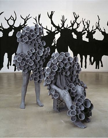
This installation features two human figures filled with cones used to pour liquids. The idea here is pretty simple: people want to consume, to get more and more poured into them. Ironically, though, all of their senses are blocked by those cones and they assemble “an armor” that makes those figures more distant from each other. This installation is an echo of Guy Debord’s “Society of the Spectacle”, about which I have already written extensively. As a quick recap, the French author in his manifesto criticizes the cult of consumption and obsession with superficial images. Although this idea is more relatable than ever, it has been repeated over and over again, especially in “deep” caricatures overshared on Facebook or Instagram (again, the irony). So this installation adds nothing more to the idea if you are over fourteen years old.
Next up is Fabio Viale with his 2018 installation titled “Il vostro sarà il nostro” (“Senin Olan Bizim Olacak” in Turkish).
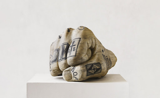
This one is possibly the closest imitation of Cattelan I have seen so far; it is impossible to miss the resemblance to his installation titled “LOVE” (which is a huge fist with raised middle finger). However, in order to understand the intricate irony Viale intended to demonstrate, one needs to know Russian language and culture; fortunately enough, that is my native language. The title of the artwork stems from an urban Russian saying “было вашим, стало нашим” that literally translates to “was yours, became ours”. The tattoo “ВОР” on the thumb means “thief”, which further supports the main idea behind the installation. Now the ironic part: the tattoo on the upper part of the fist reads “свобода – это рай” and it means “freedom is heaven”.
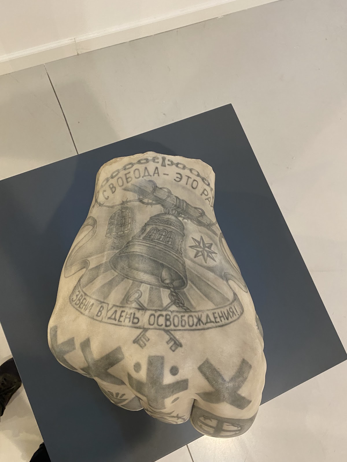
It makes sense if one views it in the context of the installation only. After all, the person is a thief and values freedom because he has probably spent some time in prison. However, when placed in the context of social commentary, the irony shows itself. The clenched fist most probably describes the authoritarian government of modern Russia, where “thief” is a reference to its corrupt oligarchy. “Freedom is heaven” in this view then mocks a regular citizen under that regime. What supports this hypothesis on symbolism is the fact that most of the tattoos on the installation were quite popular among prisoners in the 90’s after the fall of Soviet Union, and those same prisoners – “hustlers” – now comprise most of the Russian oligarchy.
One more social commentary – and this one has some more freedom of interpretation – comes from Marzia Migliora and her artwork “Made in Italy #1” (2016).
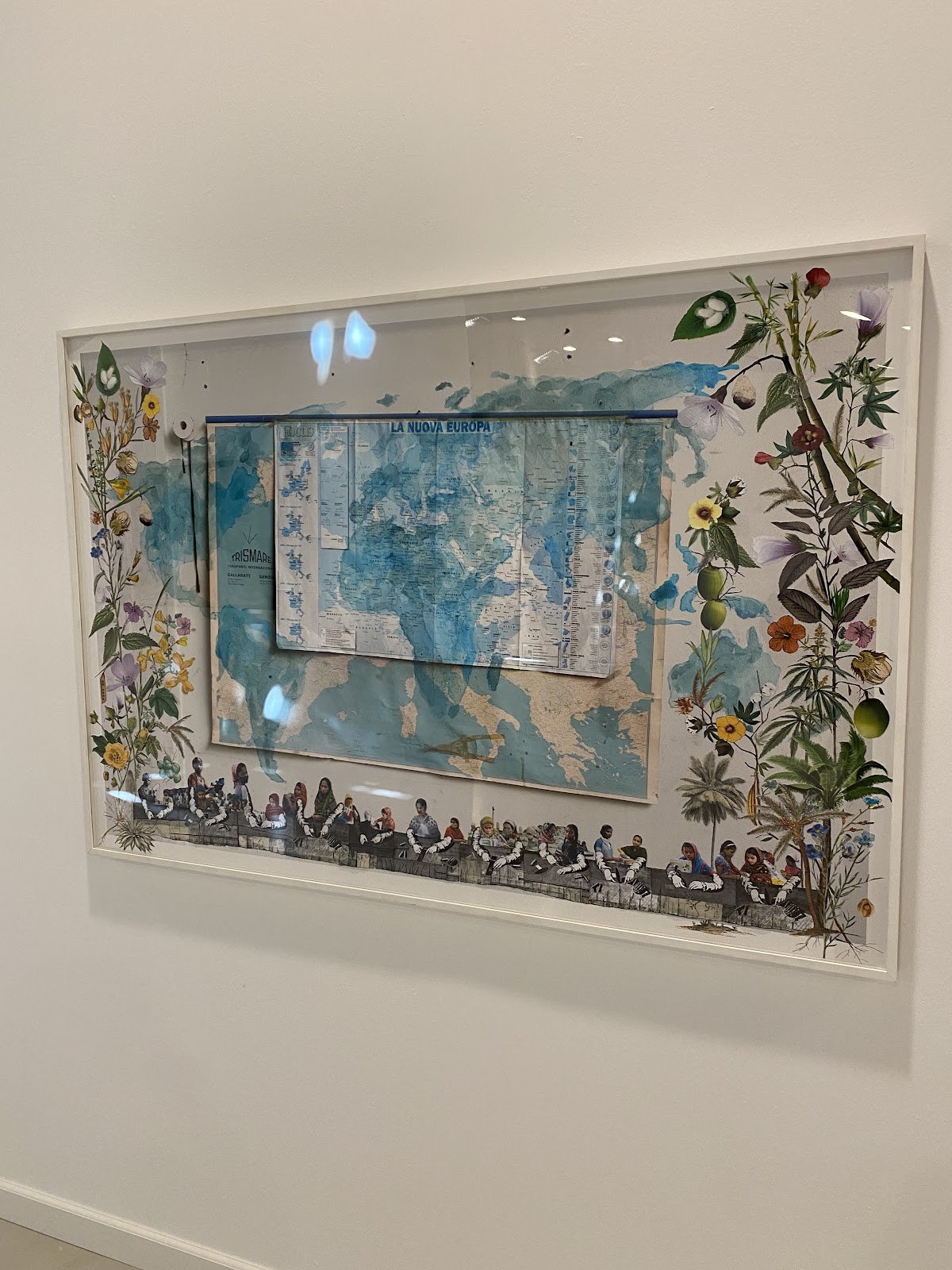
The center of the composition is dedicated to the map of Europe with a writing that says “La Nuova Europa”, which I assume means “A New Europe”. Closer look at that smaller map reveals the joke.
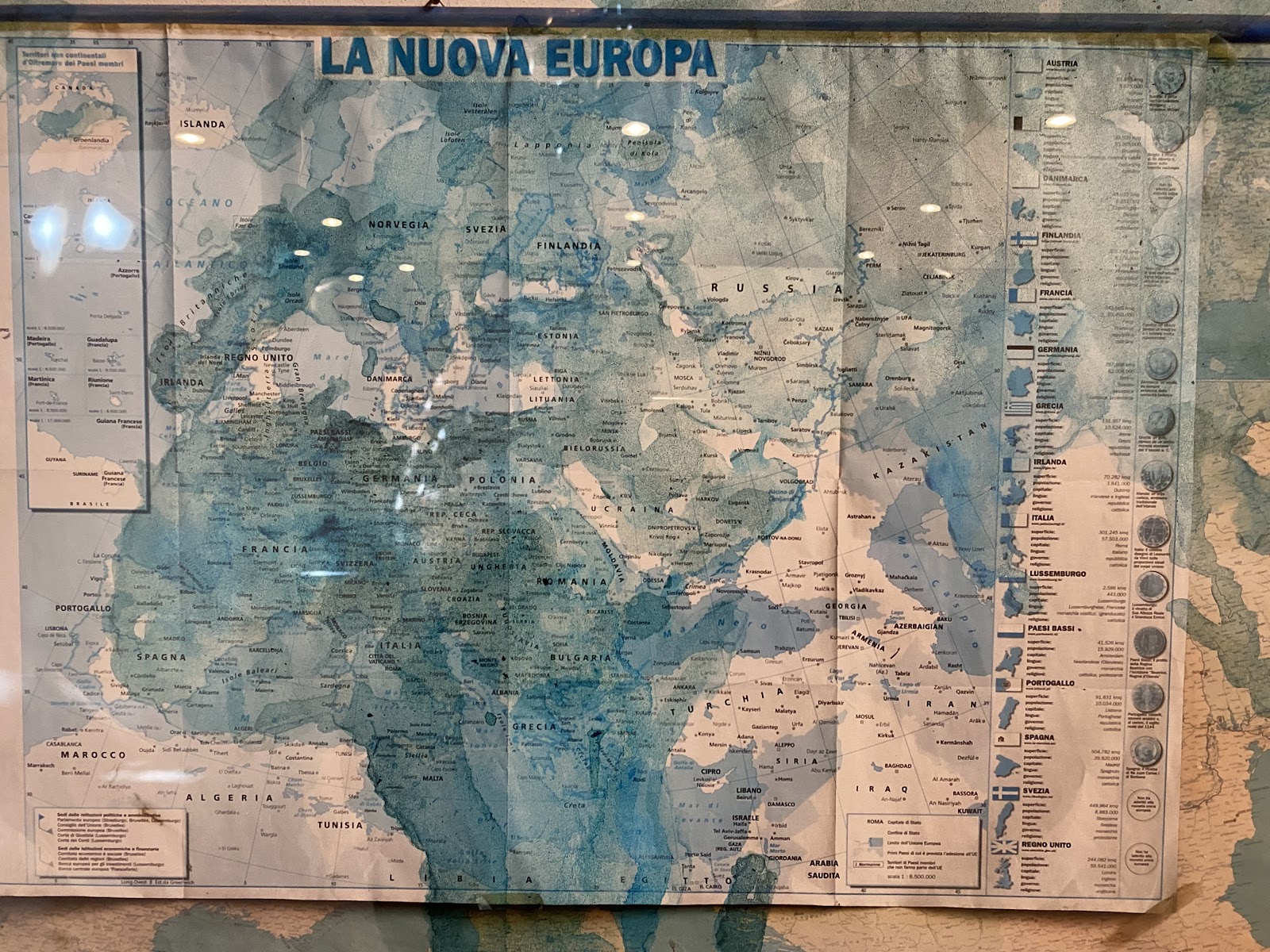
All the country names are shifted downwards, to the south. Thus we see Bulgaria or Romania located in Northern Africa. Together with blurred contours and almost nonexistent borders, my first assumption was that this is a commentary on globalization, on how everyone is everywhere and borders became just a formality. But hold up, usually migration tends to be from African and Middle Eastern countries “upwards”, i.e. to the north, right? So in this context it would have been more reasonable to shift the map in the opposite direction. Then I took a step back again and paid attention to what is below and around the map.
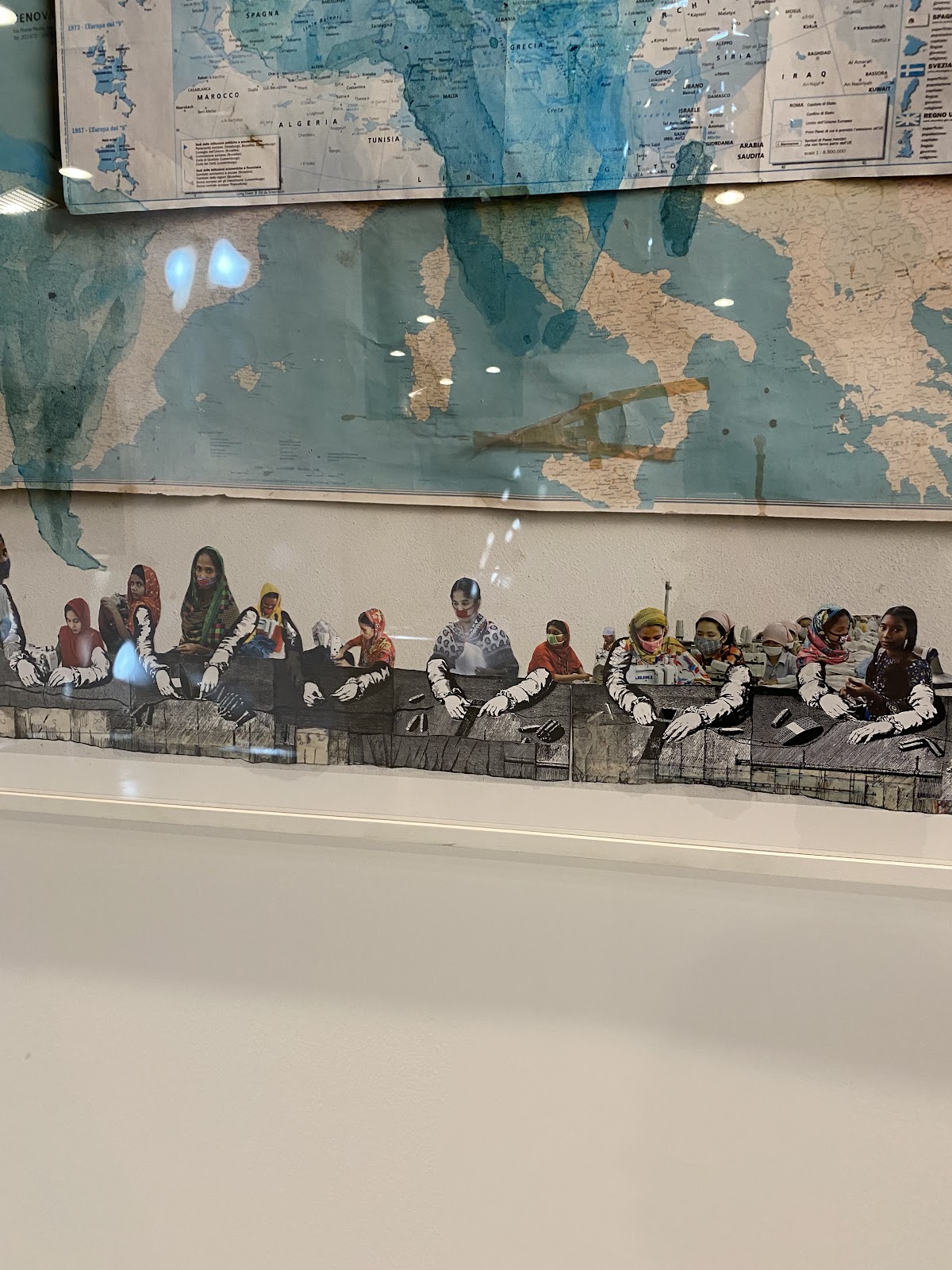
These are laborers from impoverished countries. Now all this makes sense. The title “Made in Italy #1” is the main part of the intended joke: if the clothes with that writing were truly made in Italy, then this map would be more correct than the ones we know. In my opinion, it is a pretty clever and creative in its execution joke aimed at the Italian (and overall European) textile (and overall mass consumption) industry.
Continuing with the trend of mocking fashion industries and finalizing this list, let us have a look at the 1967 installation by Michelangelo Pistoletto titled “Venere degli stracci” (“Parçavaların Venüsü” in Turkish).
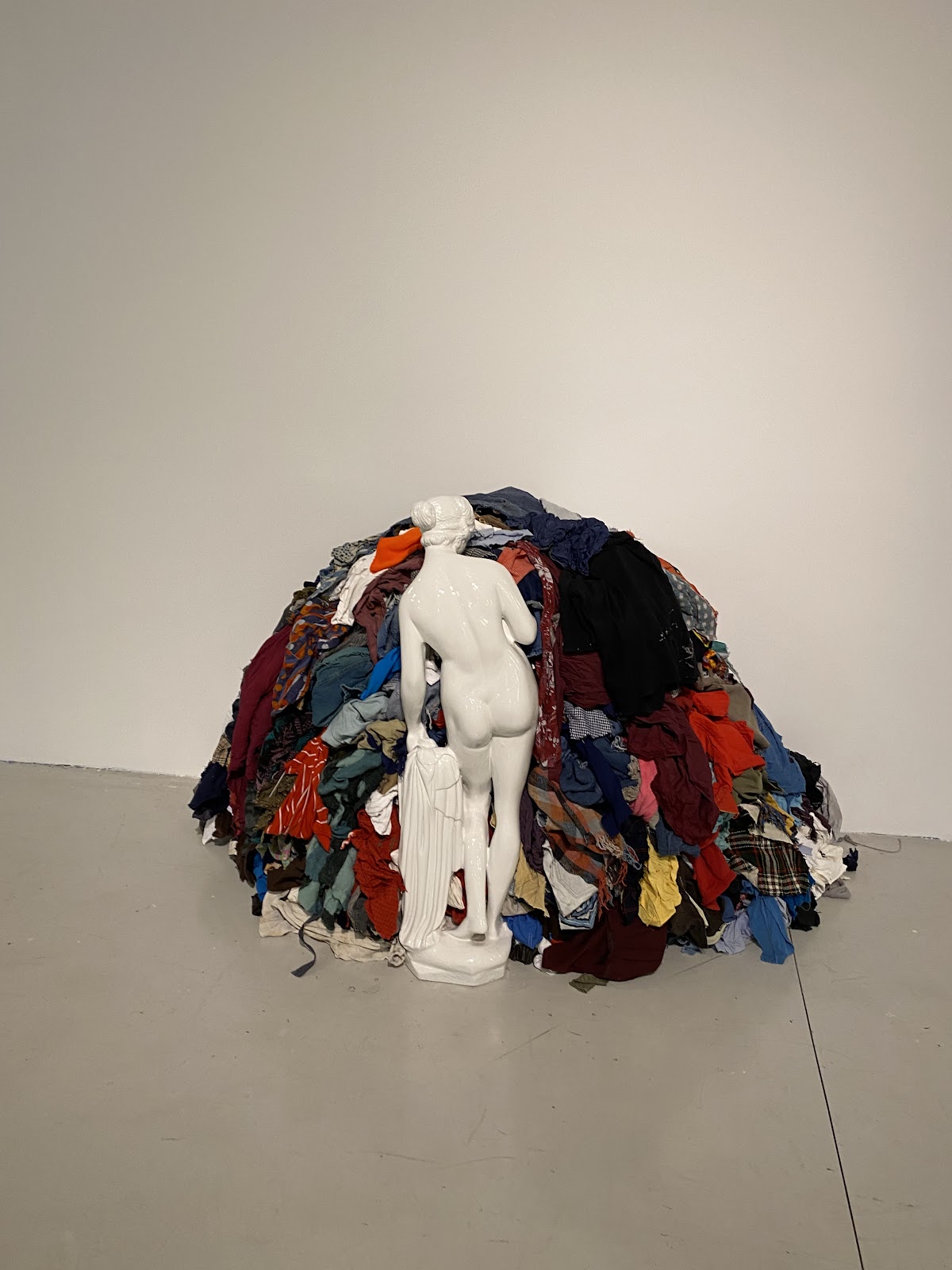
The idea behind this one is more comical than provocative. The statue featured is the one of Venus – goddess of beauty and love. This installation can be interpreted as Pistoletto saying “Look at the condition we have come to – even the goddess of beauty feels the need to make an outfit choice to fit in the beauty standards of our times”.


